Reach for the stars
The next generation of female cyclists is ready: CANYON//SRAM Racing. A team of 15 up-and-coming talents from nine countries who are turning their dreams into a professional career. With the new design "Harmonic Riff" they not only impress on the road, but also online: Our job was to bring this energy and unique style alive on their website.

Energy in motion
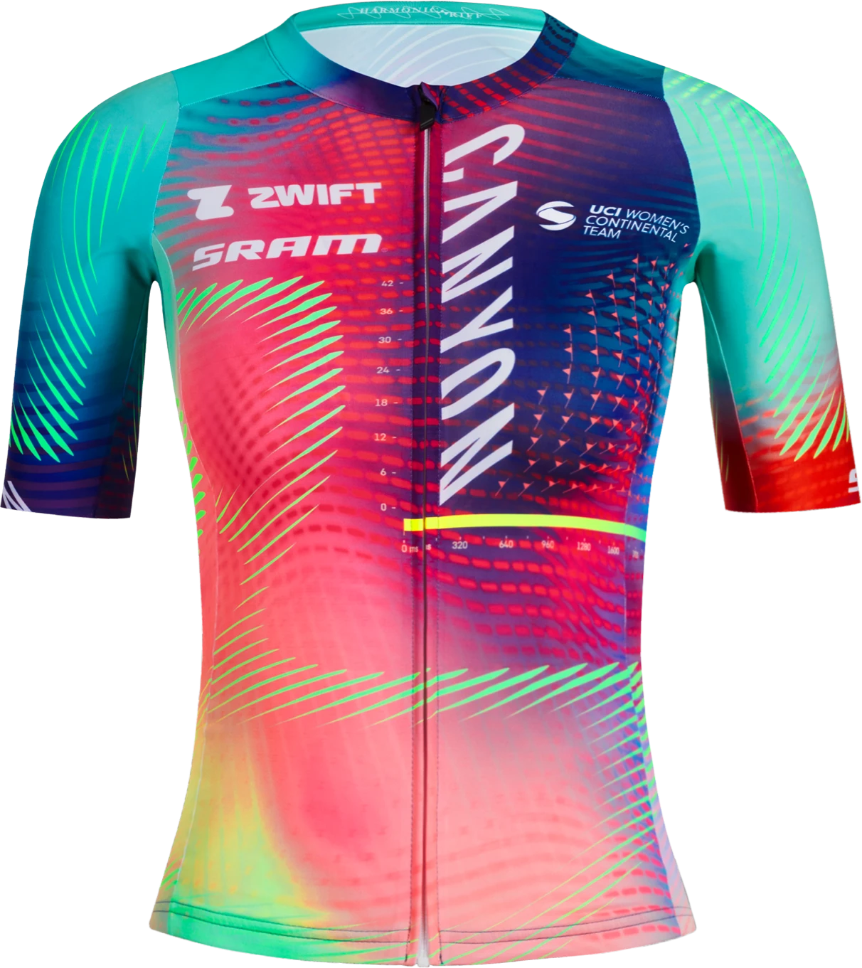
The eye-catching colours and patterns of "Harmonic Riff" symbolise the team's concentrated strength and diversity. CANYON//SRAM Racing is an outstanding composition of passion, team spirit and an unbroken will to win in the Women's World Tour peloton.
The unique style sets the team apart from others at first glance. The new design is characterised by a constant energy of chords and rhythms that capture our attention. It's all about the ups and downs that set the scene for a new song. From breaks to transitions to solos, everything is built on this constant harmonic flow.
The soundwaves of the season
The website translates the soundtrack of the racing season visually. Whether you're standing at the side of the track or sitting in front of the screen at home, the team's energy should be tangible. The website captures this energy and shows it in an impressive way. We wanted users to feel how the temperament of the new kit unfolds and is reflected in every aspect of the website.
The design follows the principles of harmony and rhythm. The recurring visual motifs that depict the harmonious flow of movement emphasise this: Vibrant colours and dynamic patterns symbolise the power and team spirit of CANYON//SRAM Racing. Interactive elements like animations and transitions mimic the dynamics and rhythm of the race. The latest news and behind-the-scenes footage bring the race atmosphere to life.

Fresh tech for a vibrant experience
With great attention to detail, we have incorporated the design of the new jerseys in flags, colour schemes and swirls throughout the entire website. The homepage, news and team pages have been made even more dynamic with new carousel and slider types. Vivid SVG animations, an eye-catching ticker and micro animations with hover effects add interactive highlights. The race calendar is now also located in the top navigation and is a real bonus on mobile devices. The best thing, however, is that the front end shines in new splendour, while the back end remains 95% unchanged - which pleases our contact partners on the customer side.
Take the lead
The new website is a powerful representation of the team and its mission. It shows how well thought-out design and creative concepts can strengthen the brand identity and the emotional connection to the audience.

Thomas JunkManaging Directordigital products, brand & marketing, Düsseldorf+49 (0)211 86701 20
