Canyon Bicycles
Canyon Shop & Brand Website
A universe with new worlds
2004 – 2019
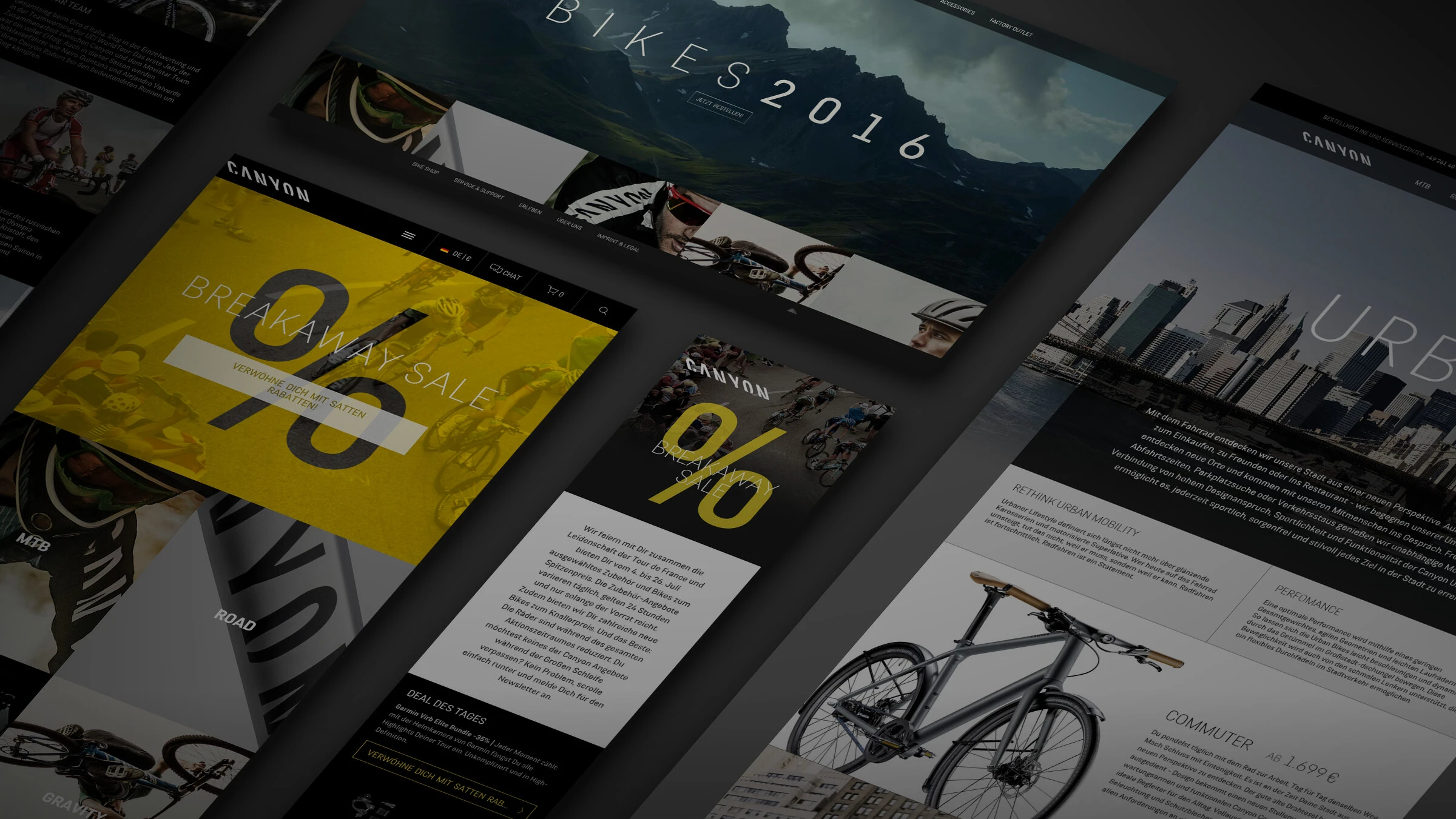
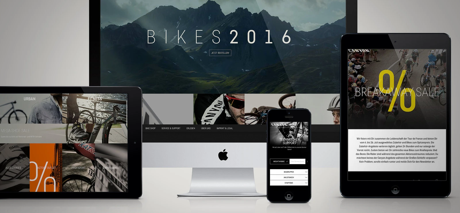
Canyon is one of the most exciting sports brands in Europe. The bikes from Koblenz are ridden by world champions, dazzling icons of the various bike subcultures and two pro tour teams, and are constantly winning prizes from audiences and critics alike. The website with its countless series, models, events, blogs and features resembled an overpopulated canyon planet: inspiring, but also overwhelming. To give the brand a responsive design (suitable for all common end devices) made reduction and structure imperative.
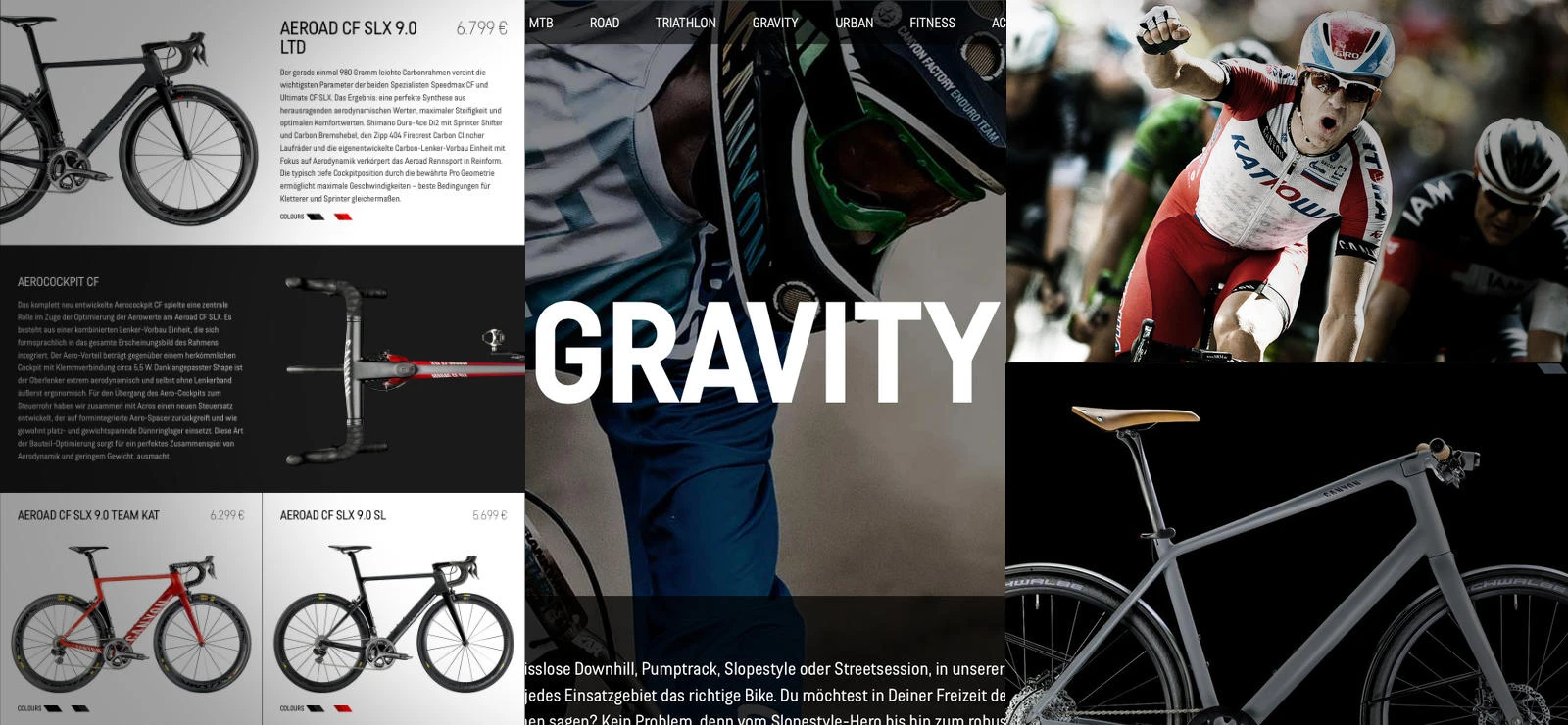
Now the website again exudes the air of slim, sporty determination. Above all, the product area creates a permanent home with the newly introduced "worlds" of each type of bike and leads the canyon lover directly to "his neighborhood". For example, it leads the racing bike enthusiast directly into the world of the noble carbon wind games, while the gravity fan, on the other hand, is led into "his" borderline bike zone of robust suspension adventure toys, without one having to touch the irrelevant world of the other. The streamlining of the contents and the accompanying homogenisation of the creative formats represented the basic prerequisite for making this universe not only accessible for tablets and mobile phones, but also inviting.

One of the biggest challenges of "responsification" can always be found in image presentation, because every image on the website - including over 150 Canyon models in colour variants alone - must be available in countless proportions due to the various screen resolutions. In addition, the appropriate image must always be displayed for each page call.
And if the many beautiful, large images of the Canyon pages cannot be loaded quickly, especially with mobile access, nothing helps.
For this purpose, we combined various open source technologies into a sustainable method for the delivery of images on responsive websites.

The latest HTML tags and attributes provide a modern, uncomplicated way to deliver and position the right images on any device. In older browsers, a Javascript package (Polyfill) bridges the weaknesses in the display. Furthermore, the many thousands of images and image variants do not all have to be pre-produced. Here, a PHP script ensures that the appropriate image variant is generated directly on the server if required.
This increases the loading speed of the pages, because through caching, once scaled sizes are readily available at the next access. In addition, the images for the small smartphone screens are automatically compressed without any visible loss of quality. In combination with other powerful tools such as Adaptive Images and Lazyload, the amount of data per page could be reduced by up to 70%.
- Period
- 2004 — 2019
- Platform
- bootstrap
- Image Optimisation
- imageMagick, respImage