Finest Bragging Tino Pohlmann Photography
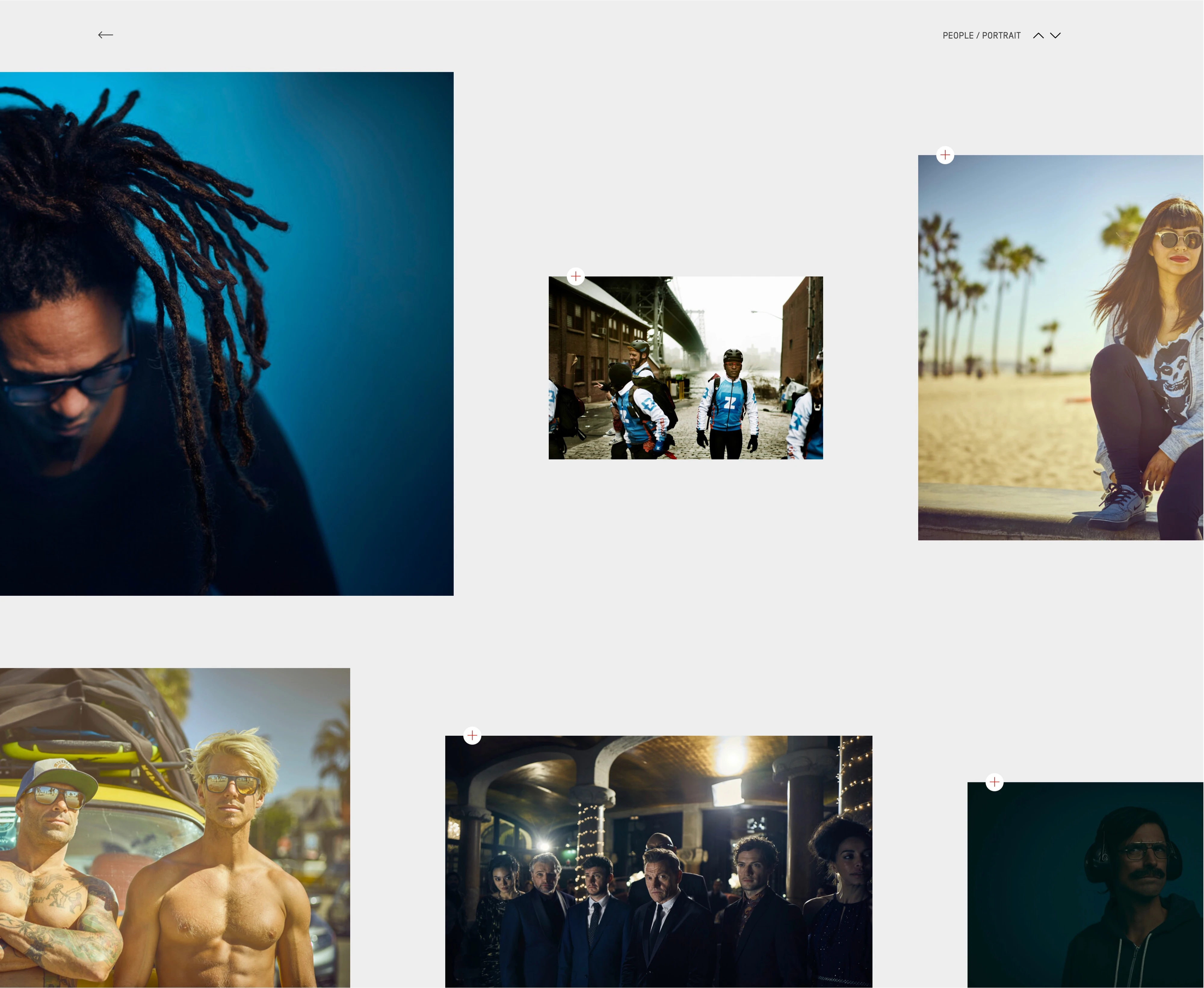
The new portfolio website is even more beautiful, more lightweight and more powerful than the award-winning website of 2014, which we also had the pleasure of developing with Tino Pohlmann. But the new one simply does everything better.
And the real star - the photography - shines even more than before. Which by no means comes naturally, since the functionality has grown, there are more content levels, even more responsive output - and all of that with full CMS support.
With a site that has neat animations even for small things, state-of-the-art cross-fades and very individual, but intuitively minimalistic tools, you wouldn't expect it to be completely CMS-supported by the author himself. But it is. And as you would expect from exhibitions of this caliber, the artist himself can adjust the hanging individually and continuously.


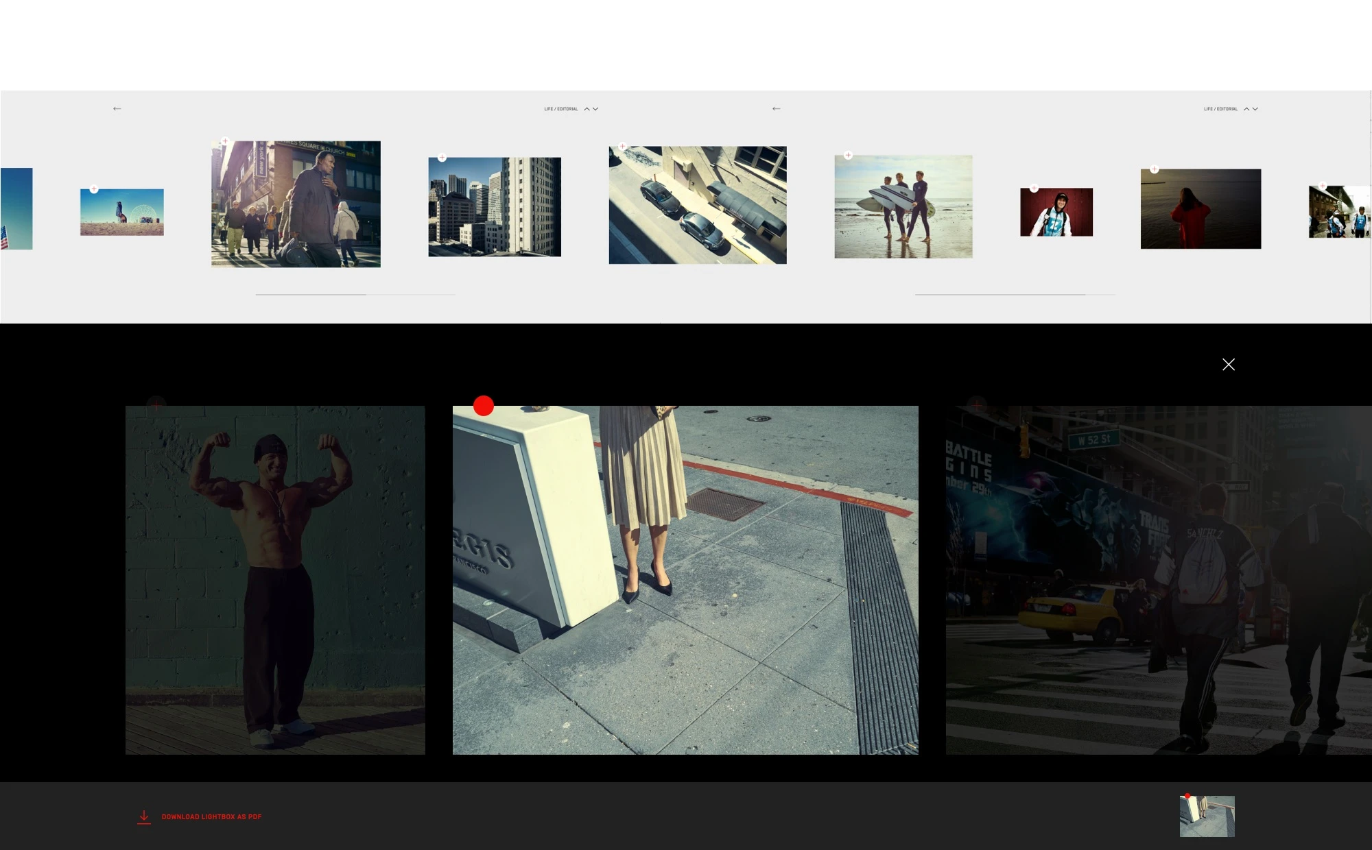
The design of the elements and their operation is ultra-minimalist and bombastic at the same time. Everyone is invited to let the huge horizontal navigation glide back and forth and enter the various rooms of the exhibition through it.
Of course, real exhibitions come with a catalogue, but there is usually just one. Here there are infinitely many, because everyone (every art buyer) can put together his Top 5, Top 10 or Top All and download them as custom PDF files.


- View
- pohlmann.photo
- CMS/Backend
- Neos
- Award
- AWWWARDS honorable mention